Review: CarpodGo’s T4 Plus is CarPlay that’s bright, fast and in your face.

Note: In June, the personal technology column I’d written for more than 30 years at the Chronicle ended. After spending the summer enjoying being a bum, studying the art of retirement and mostly watching paint dry, I’ve decided to write occasionally here when the mood strikes, or when I come across some gear I think you’ll want to know about. That’s what this is: CarpodGo approached me about reviewing their latest CarPlay display, and as you will see, I had a personal reason for checking it out. Expect to see more of this in the coming months. -D.S.


Almost a decade ago, my lovely wife bought a new car: A 2017 Prius 4. I’d gotten a look at this redesigned version of Toyota’s original hybrid the year before, when I reviewed the 2016 version for my blog. My wife had a 2012 Prius and loved it, and shortly after my review she gave that vehicle to our oldest.

While the 2017 Prius was a comfortable car with killer gas mileage – I had been able to get 85 mpg under the best conditions – it lacked one important feature. Toyota had not yet adopted Apple’s CarPlay, which mirrors an iPhone user’s phone screen in a vehicle’s infotainment system. I enjoyed driving her car until, two years later, I bought a 2019 Toyota C-HR, which did have CarPlay. Suddenly, I was spoiled, and I would always prefer to drive my car, despite the Prius’ more economical oeuvre. I became a CarPlay snob.

And it’s not just me. iPhone users who own vehicles with CarPlay usually become die-hards. Just ask GM, who suffered the slings and arrows of internet scorn when the company announced it would support neither CarPlay nor Android Auto in its latest electric vehicles – and then doubled down by saying that it would eventually drop the features in its gasoline-powered fleet as well.

GM’s stance pretty much guaranteed I’d never buy a GM EV; many other CarPlay fans feel the same way. (It’s worth noting that while Android Auto is also digitalia non grata on GM cars and trucks, Google is supplying a custom version of Android as part of its software package.)

The point to be made is this: Once you’ve had a phone-mirroring technology like CarPlay or Android Auto on your dash, it’s very hard to go back. But if you have an older car or truck that doesn’t support CarPlay, you’ve got two options: Either replace the head unit for the stereo/infotainment system with one that allows for phone mirroring, or add a standalone display dedicated to mirroring an iPhone or Android device.

The joy of the display

The latter category is simpler and less expensive, and there are literally dozens of models available on Amazon. However, their quality varies, and many suffer from the same problems as the cheap adapters that provide wireless CarPlay/Android Auto capabilities to vehicles that only have the wired variant. The issues include connection drops and sluggish performance. In addition, the cheaper standalone displays are sometimes slow and not bright enough in direct sunlight.

So, when vehicle-screen maker CarpodGo offered a review unit of its latest high-end CarPlay screen, I was intrigued. I’d long thought about trying a standalone display for CarPlay in my wife’s Prius, and here was an opportunity to see what she’d think. Even though I was trying really, really hard to be retired, I told the Chinese-based company to bring it on.

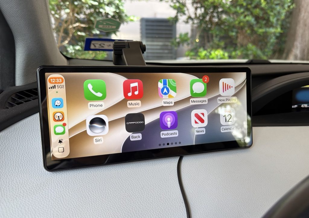
CarpodGo’s T4 Plus features a 10.9-inch diagonal display with a brightness rating of 1,000 nits. (Dwight Silverman photo)

CarpodGo shipped me the T4 Plus, its flagship device that just became available on Amazon, where it currently sells for a list price of $250. The T4 Plus is a beast, with an expansive 10.9-inch diagonal IPS display that boasts a brightness rating of a whopping 1,000 nits and a refresh rate of 60 Hz. It includes several different dashboard mounts, a custom DC-port plug to power the screen and an actual physical manual – a rarity these days, when online documentation is more often the standard – though it’s printed in the tiniest font imaginable. A magnetic base connects to the various mounts that lets you quickly remove the display if you don’t want to leave it in your car when when away.

A smaller version, the T4, is functionally identical but with an 8.9-inch diagonal display. It lists for $230.

CarpodGo also sells an optional rear-view camera for older vehicles that lack one, which is now required as a safety feature. It works with both sizes.

My original approach was to set this up in the 2017 Prius and let my wife use it for a while as part of the review. But just before the T4 Plus arrived, our kid’s hand-me-down 2012 Prius incurred yet another major repair. As reliable a vehicle as it’s been, after 14 years its time had come – it was costing us more than it was worth. We made the call to give them the newer Prius, which meant I needed to drive the car nearly 800 miles from Houston to where they live in southwestern Illinois. My wife already had a plane ticket for a planned visit, so I was on my own on the road – just me and the T4 Plus for two full days of summer driving.

Set up and go

Getting the display ready to go was fairly easy. As is the case with wireless CarPlay adapters, CarpodGo’s screens connect to a phone first via Bluetooth, then hand off to a WiFi connection. Since the screens don’t come with speakers, you must also make sure you have a Bluetooth connection to your infotainment system – which, if you’ve been toodling around in a vehicle without CarPlay, you likely already have – for audio and phone calls.

Oh, and here’s a setup tip: You don’t actually have to be in the car to initially pair your phone to the screen. You can do it in the comfort of your home, with the screen connected via USB-C to any charger that supports the Power Delivery charging protocol and can provide at least 9 volts of power. Once paired, you can focus in the vehicle on getting the display mounted on the dash.

And getting it mounted is the bigger challenge. Both the T4 Plus, which weighs just over a pound with the magnetic base attached, and the smaller T4, require that the bottom of the screen be resting on the top of the dash. That’s because with any of the supplied mounts, the vehicle’s movement can cause the whole assembly to come loose while driving if the display is suspended. As a result, finding a location in the vehicle where the screen is in easy reach for touching but also adequately supported was tricky in the Prius. I wound up placing it to the left of the steering wheel.

Also keep in mind that, even though this is wireless CarPlay, it’s not really “wireless.” In fact, you’ll need two cables – one to feed power to the display, and another to keep your phone charged while using GPS and navigating. For that reason, I opted not to use the included power cable and plug that came with the T4 Plus, because while it has a USB outlet for a phone on the plug, it’s USB-A, which doesn’t provide enough muscle to keep my iPhone 17 Pro Max charged while Waze or Apple Maps keep track of where I am. Instead, I used a 120-watt adapter that plugs into the DC port with 2 USB-C connections.

On the road with the T4 Plus

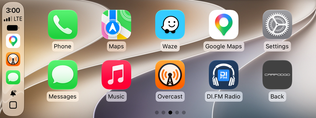
During the two-day drive, using the T4 Plus for CarPlay was a joy. Its wide display presents an additional column of app icons than found my C-HR’s smaller screen. It’s also much faster then my car’s built-in display – swiping between screens and opening apps was lightning-quick. And the super-bright screen was perfect for the sunny, cloudless conditions of a long summer road trip. (It auto-dims as needed.) The connection was rock-steady, and connected to my phone instantly whenever I started the car.

Screenshot of the T4 Plus display, showing two rows and generous five columns of apps.

But those sunny conditions resulted in one of the few glitches in my testing. Temperatures all along the route were close to or sometimes over 100 degrees, and because the T4 Plus was atop the dashboard and thus was often in direct sunlight. The resultingheat would cause the display to slow down so that apps dragged while opening, and moving between home screens was sluggish. The fact that the back of the screen is black plastic didn’t help, and for much of the drive was hot to the touch. When it was not in direct sunlight, or after I’d stopped for a while and then got back on the road, performance returned to normal.

This is not uncommon among smart devices. Anyone with an iPhone who has it mounted in a vehicle so that direct sunlight hits it has experienced the “Charging on hold until iPhone returns to a normal temperature” message. In this case, the T4 Plus was usable, just a little annoying.

One other annoyance had nothing to do with the screen itself, but rather the Bluetooth connection in the Prius. Because the vehicle dates back to 2014, it uses an older version of Bluetooth, and the audio during phone calls was, um, sub-optimal, with low-quality sound that was sometimes difficult to hear. This was something my wife often complained about while she was driving the car, and on my trip I felt her pain. The T4 screens do have have the option to use a direct AUX jack connection or even an FM connection to the radio for audio. I didn’t try either.

One feature I wish the T4 Plus had: A dashcam. Given that the screen must sit atop the dashboard, it has a great view of the road ahead. I would have preferred that over the rear camera option, though adding a recording camera to the display could have made the heat issue worse.

One other missing feature: Over-the-air firmware updates. The T4 Plus and T4 require that you download new firmware to a flash drive, which is then inserted into a USB-C port on the back of the screen. This is cumbersome and could result in errors. A CarpodGo spokesperson said the company is working on adding OTA updates, but didn’t have a timeline for when.

Conclusions

The CarpodGo T4 Plus is an excellent standalone CarPlay display, and if you’re in the market for a way to bring CarPlay to an older vehicle, it’s worth your consideration. However, I have one caveat. In a smaller car like the Prius, or any vehicle with limited space to mount the display, I’d recommend the smaller, 8.9-inch model, which has the same brightness and speed.

Is your car’s cabin even more cramped? The company also makes the Mini, a 6.9-inch version with the same 60-Hz refresh and 1,000 nits of brightness. It lists for $120, and is easily the best value of the three. Another benefit: The Mini does not require that the bottom of the screen be resting on the dash. Bueno.

Column Day [Updated]

(Last updated 1:55 pm CDT August 6th, 2026)

[Update 6/24/2026 to add a link to my final column and to tighten and polish.]

Two days after I’d learned the Houston Chronicle was ending my personal technology column, my daughter urged me in no uncertain terms that I must open my Father’s Day present – which had already arrived – right now, a month ahead of time.

When I did, I discovered why she was so insistent.

I typically write my column on Wednesdays, with the goal of filing by the workday’s end. I call this “Column Day,” because I set all things aside to get it done, including familial relationships. When my daughter calls to chat on the phone, I almost always wave her off, saying, “Sorry, Jess, it’s Column Day.”

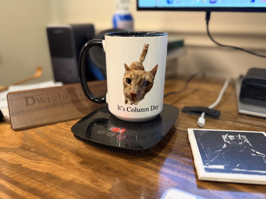
The gift, it turns out, was a coffee mug with a picture of Milo, our needy orange tabby, demanding attention above the words “It’s Column Day.”

Sorry, Milo, I’m on deadline.

Get you a daughter who gives you presents like this. Also, if you zoom in, you will see a disgusting amount of cat hair on the mug warmer.

At this writing, there are four more Column Days. My last Personal Tech dispatch publishes online June 20, and the next day in print. But thanks to Jess’ thoughtfulness and wicked sense of humor, I’ll always have the mug. [Update: You can read that final column here.]

I’ve been writing the column, with a few hiatuses along the way, since 1993. It’s had several names over the years, but it has always had one purpose: To help Houstonians understand the personal technology revolution that continues to roil our collective waters. You can drown in the flood or you can learn to at least dog paddle. If you’re really into it, you might even get to a decent breaststroke.

My column is the longest-running one in the Chronicle at the moment. I consider it an honor that they’ve kept me around. I left the paper in January 2021 after taking a buyout and a planned retirement. But when I announced I was leaving, I got a call from Forbes and an invitation to start a paid tech newsletter for them. I’d loved doing a my newsletter for the Chronicle, one of the paper’s earliest forays into the current trend, and it was doing well, so I jumped at the chance. But Forbes did a lousy job of promoting it, and paid newsletters on topics where there’s so much free content available online tend to falter. Frustrated, I left after a few months.

And when I did, Rob Gavin, then the Chronicle’s business editor, asked if I wanted to resume my local column as a freelancer. I was happy to do so. I was back home.

So it went for more than four years. Monday’s email was a surprise, but I was not all that surprised when it came. I was writing a gadget/gear/app/internet personal technology column that only occasionally focused on local issues for a local publication. Local is the biggest strength newspapers have in the fractured media landscape, and I was not always playing to it. In addition, I was a freelancer, and historically when a publication needs to trim closer to the financial bone, non-staffers are low-hanging fruit.

So the answer to the question, “Did he jump or was he pushed?”, is assuredly the latter. But I had, for some time, been contemplating the former, considering stopping the column when 2026 ended.

Although my column only appeared weekly and took a day to write, it required a lot of time both to prep for it and to keep up with tech developments. Because I was not covering the topic on a daily basis, I had a lot of reading to do to keep up. The writing of Personal Tech was a (mostly) a joy, but staying in the hunt had become a grind.

I turn 70 in August and have been pondering actual retirement. The running joke in my social media profiles is that I am “kinda” retired and that I am “not good at retirement.” Maybe, I had been thinking, it’s time to get good at it. The Chronicle made my decision for me, and as the kids say, I am not even mad.

I also realized after getting the news that I’m almost the last personal tech newspaper columnist standing. When the column first began under the title “Computing,” there were quite a few of us. Back then, tech columnists and the technology sections that hosted them were the new shiny objects at newspapers, but as the internet went mainstream technology coverage moved to that platform – as did just about every other topic, eventually.

As far as I can tell, there’s only one other columnist writing about personal tech in the classical way I did for local papers, and that’s my old friend and one-time book collaborator Larry Magid, whose column still appears in the San Jose Mercury-News. (Hang in there, Larry!)

There are other longtime local tech journalists who once had columns who are still active, but they are doing more news/issues writing these days. The pure chroniclers of consumer digitalia are now found on the web and/or on video, particularly YouTube or TikTok.

Marcus “MKBHD” Brownlee is the new Walt Mossberg.

When I said on social media on Wednesday that my column is ending, a lot of folks asked what I am going to do next. The honest answer at the moment is, “I’m not sure.” I’ve got this oft-neglected blog; I could always do more writing here. There’s always launching yet another paid newsletter to make a little coin. I could consult, or I could do something completely different, not related to writing or tech.

As you may know, I help out with Space City Weather, Eric Berger’s and Matt Lanza’s Houston forecasting blog. That gig scratches a lot of itches – I help with social media, manage the development of the SCW weather app, provide ideas and emotional support, and even do a little writing.

Or I could experiment with doing nothing (except for SCW), perhaps the most radical next step of all. Those who know me well think I could never be idle for long – which may be the best reason of all to try it.

But whatever happens, I consider myself blessed. I’ve able to do for decades what journalists strive most to do – help people – thanks to the Houston Chronicle and the various editors, colleagues and executives who’ve encouraged and supported me.

Even more so, I’ve been blessed by those who have read and followed me over the years. Writing for you has been my career and my calling. I think I have succeeded. What more can I ask?

Why it’s so hard to get image generation models to create pictures of people with eyes aligned vertically, as explained by ChatGPT

(Last updated 3:15 pm CST February 19th, 2026)

A man with eyes aligned vertically instead of horizontally, as generated by ChatGPT 5.2 after three tries.

Me, after trying three times to get ChatGPT to create a picture of a man with eyes aligned vertically:

That’s correct! Why was that so hard for you to generate in the way I described it?

ChatGPT 5.2:

Short answer: because image generation models are strongly biased toward human facial anatomy, and “removing” expected features is harder than “adding” unusual ones.

Here’s the straight talk.

1. Human-face priors are extremely strong

These models are trained on vast numbers of normal human faces. The learned prior is effectively:

  • Two eyes
  • Horizontally aligned
  • Symmetrically placed

When you asked for vertically aligned eyes, the model complied by adding eyes rather than subtracting the canonical pair, because adding violates the prior less than deleting it. Deletion fights the model’s internal consistency checks.

2. Negative instructions are weaker than positive ones

“Remove the normal eyes” is a negative constraint. Image models handle positive constraints (“add,” “place,” “include”) far more reliably than exclusionary ones (“do not include,” “remove,” “only”).

So the model kept reintroducing:

  • The default horizontal eye pair
  • Even after multiple attempts Because that configuration is statistically “correct” for a face.

3. Iterative edits weren’t true edits

Despite the conversational framing, each attempt was effectively a fresh generation, not a pixel-level edit with hard masks. Without an explicit mask saying “this area must not contain eyes,” the model kept reconstructing a plausible face.

This is why it took repetition to finally overpower the prior.

4. Ambiguity in anatomical language

Phrases like:

  • “eyes in the normal places”
  • “just above the nose” are clear to humans but still somewhat fuzzy to a model that reasons probabilistically over pixels, not anatomy diagrams. Until the final attempt, it was still “hedging” by keeping extra eyes.

5. Why the last one worked

By the final prompt, you had:

  • Repeated the constraint
  • Narrowed the acceptable outcome
  • Forced a binary condition: only two vertically aligned eyes

At that point, the probability mass finally collapsed onto the configuration you wanted.

Bottom line

This wasn’t user error. It’s a known limitation:

  • Adding anomalies is easy
  • Suppressing defaults is hard
  • Faces are the hardest case

If you wanted this done faster in the future, the most effective phrasing would be something like:

“A man’s face with no horizontally aligned eyes anywhere on the face. Exactly two eyes total, stacked vertically along the facial midline.”

Blunt, redundant, and absolute constraints work best.

You weren’t asking for something unreasonable—the model just had to be bludgeoned into compliance.

——-

The initial prompt: Generate an image of a face of a man, in his mid 40s, with eyes arranged vertically on the face instead of horizontally, as they normally are.

The rejects:

How I set up a new Mac [Updated x3]

(Last updated 3:07 pm CST February 19th, 2026)

[Updated this post on 2/5/2026 to reflect changes in the process, and additional apps I install.]

Because I regularly review Apple’s Mac laptops and desktops, I’ve developed a setup routine for to make them my own for the brief period I have them. It’s similar to what I do when I get a new Mac for myself, though that takes place over a period of days and includes copying over data that I don’t have stored in iCloud and apps that are mostly for the researching and writing I do for my column.

Yeah, I know, I could use Migration Assistant or other tools to automate this, but I like the idea of a fresh start, and being able to ponder, then pick and choose what I want to keep or discard.

Of course, there are steps I’ll forget, so I wanted to write the process down. This is as much for my convenience and forgetfulness as it is for your geeky voyeurism. Anyway, here’s how it goes:

  • In the initial setup process, I typically just keep the default selections. If I want to change something, I can always do it later.
  • Go to Settings > Trackpad, turn on Tap to click
  • Open Finder, drag Applications, Utilities, Documents folder to the right side of the Dock
  • Settings > Display, set to More Space on a laptop, Default on a desktop
  • Finder > Settings, add Hard Disks and Connected servers to the desktop, remove CDs, DVD, iPods
    In Sidebar, add user folder
    In Advanced, performing a search to Current Folder
    In Finder > View in the Menu bar, turn on Path Bar, Status Bar, Tab Bar
  • In the Dock remove Keynote, Numbers
  • Open Safari, download and configure Microsoft Edge, set as Keep in Dock (Sorry, Mac purists, but I fell in love with Edge when I saw its vertical tabs implementation, and I’ve never looked back.)
  • Settings > Desktop and Dock, enable magnification, set Edge as default browser
  • Download, install and configure iStat Menus
  • Download, install and configure Apparency
  • Download, install and configure Ice (a beta Menu Bar manager)
  • Download, install and configure AirBuddy
  • Download and install Geekbench
  • Download, install and configure Parcel, a shipment tracker
  • Download and install Mactracker
  • Download, install and configure ChatGPT
  • ADDED: Download, install and configure Bauhaus Clock.
  • ADDED: Download, install and configure Better Display.
  • ADDED: Download, install and configure Coconut Battery.
  • ADDED: Download and install Folder Quick Look.
  • ADDED: Download and install MacWhisper.
  • ADDED: Download and install Descript.
  • ADDED: Download and install Our Groceries.
  • ADDED: Download and install Overcast.
  • ADDED: Download and install RadarScope.
  • ADDED: Download and install the Space City Weather app.
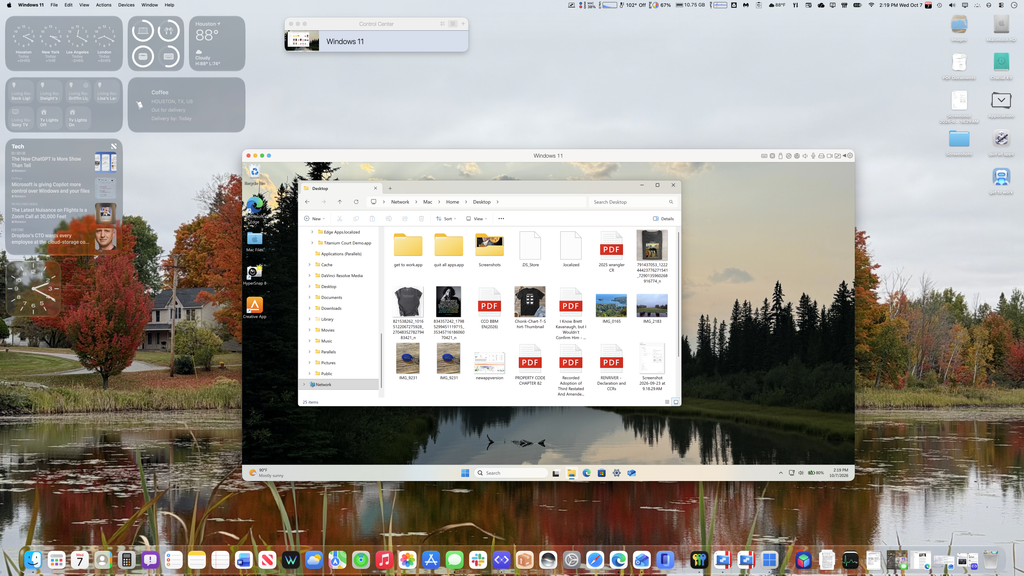
  • Download and install Parallels for Mac and Parallels Toolbox, enabling Toolbox’s Free Memory and Clipboard Manager to appear in the Menu Bar. Set up a Windows 11 VM in Parallels.
  • Download, install and configure Spark Desktop, set as Keep in Dock. (After a disastrous version 3.0 release, Spark has redeemed itself with its latest, 3.5 update. Just don’t expect too much from its ChatGPT integration.)
  • I recently subscribed to Microsoft 365, installed via the web. I am using Outlook as my primary email client, but continue to use Spark to see how its development is going.
  • Download, install and configure the Mona 7 for Mastodon client
  • Open Messages, turn on Messages in iCloud
  • On iPhone Settings > Messages > Text Message Forwarding, enable messages from the new Mac
  • Enable iPhone Mirroring with my current iPhone.
  • Set Weather, Text Edit to Keep in Dock
  • In Settings > Control Center, let Weather to post current conditions in the Menu Bar.
  • Set macOS Passwords app to show its icon in the Menu Bar
  • In Automator, create “Get to work” application to launch Spark Outlook, Edge, Mona and Messages, put alias on the desktop
  • In Automator, create “Quit all apps” application, put alias on the desktop

That’s it for now. I’ll tweak this over time.

Ads, overlays and paywalls, oh my! How to get around the web’s worst annoyances (updated x4)

(Last updated 3:16 pm CST February 19th, 2026)

A view through a wall, created using Diffusion Bee, a Stable Diffusion app for the Mac.

(Note: During my brief stint at Forbes, I wrote a newsletter item and subsequent story on how to get around the web’s biggest annoyances – intrusive ads, overlays and paywalls. Since that May 2021 piece, I’ve found some new tools and strategies. This is an updated version. Content from the original Forbes article is included with permission. )


If you’re like me, you’ve got a love/hate relationship with the web. Bill Gates may have sought to bring “information at your fingertips” via the PC and Microsoft’s software, but it was Tim Berners-Lee, the inventor of the World Wide Web, who made it happen.

But even Berners-Lee is dismayed at what the web has become, saying today’s version of his creation is laced with “perverse incentives.” Indeed, trying to get the information, goods and services you want from the web involves running a gauntlet of intrusive ads, obstructive overlays and unyielding paywalls.

To be clear: Businesses and individuals deserve to be compensated for the information and services they offer online. But too often how they go about it gets in the way of the product itself. Everyone reading this has had the experience of visiting a website that has so many ads, videos, popups and overlays that it’s nearly impossible to enjoy the content.

Over the years, I’m assembled a toolkit of browser extensions and strategies that have made the web tolerable. I use these judiciously in instances where doing so might deprive a website of needed revenue. But at the same time, I don’t have much sympathy for those sites that are so junked up with distractions and obstructions that they’re inaccessible. Desperate sites call for desperate measures.

Here’s a list of tips, tricks and tools for restoring some sanity to the web. (And if you have other tips that aren’t mentioned here, please let me know.)

Ad Blockers

The most common way to clean up your web experience is through ad or content blockers. As the name implies, they block ads and other revenue-producing components from appearing on web pages. Out of the box, they’re a shotgun approach, and as such they also deny revenue to sites that rely on advertising to survive. “Free” sites are not really free, and many site operators consider content blockers to be unethical.

Nevertheless, the use of ad blockers is growing, with between 27% of U.S. web users employing them, compared to almost 43% globally.  

Content blockers are available as extensions for desktop web browsers as well as iOS and Android smartphones and tablets. They allow you to block everything, which leaves sites you visit fairly ad-free, but most also feature controls that let you customize what happens at specific sites. For example, if you visit an ad-supported site regularly and its ads aren’t overbearing or intrusive, you can put its domain into what’s called a whitelist or allowlist – and indeed, this is the best use of it. If you love a free site’s content, add it to your blocker’s allowlist.

Many content blockers will also prevent tracking by third-party cookies, and you can typically toggle this feature on and off. If privacy is important to you, content blockers can help. (Though some web browsers themselves can block tracking cookies, most notably Firefox, Safari and Microsoft Edge.)

Blockers also have downsides, sometimes blocking things you may want to see. If a site isn’t behaving the way you expect it to and you have a blocker installed, disable it for that site. 

I use Ublock Origin on Microsoft Edge and Google Chrome browsers. On my iPhone, I prefer 1Blocker. Both seem to be better about not interfering with a site’s desirable features than most. Tom’s Guide has a roundup of the best blockers for traditional computers; iMore has a list of iOS blockers; and Android Authority rounds them up for that platform. And The Wirecutter at the New York Times has a roundup of content blockers for those whose main concern is privacy

Non-blocking Alternatives

There are other ways to view content without ads or other distractions without installing a content blocker. Some of them are already built into your web browser.

A feature found in Apple’s Safari (both desktop and mobile), Microsoft’s and Mozilla’s Firefox browsers provide a “reader view” that presents text without background images, ads, video players, sharing buttons, etc. Typically, these features increase the font size and tweak the background color of the page to improve readability. In some instances, the feature can reveal full stories that show only a stub as part of a paywall. 

[Added 2/6/2025] Also in Safari in iOS, iPadOS and macOS: Hide Distracting Items, which allows you to tag and then remove web page components that are annoying. Tap/click the button, do the same for the thing you want to remove, and watch in wonder as it is literally “blown away” off the web page.

While Chrome doesn’t have a reader feature built-in, there are several extensions that provide it, though I’ve found that many of them don’t work as well as those built in to other browsers. This Chrome extension does a decent job of mimicking the Reader View in Firefox.

primarily use Microsoft Edge on both Macs and Windows PCs, and it puts an icon that looks like an open book in the URL field when a page works with reader view. Clicking it presents a highly readable view that’s pretty smart about providing both text and images of value. You can typically set reader view to always be used on specific sites, or toggle it as needed on stories.

Battling Overlays

Overlays are one of the most annoying web obstacles. These first cousins to popup ads place an image on top of a web page, and are often used to push newsletters, subscriptions and other products. They also can serve as rudimentary paywalls, blocking your view of content unless you pay a subscription fee. They’re also used to complain that you have a content blocker installed, and request that you disable it for that site.

Most content blockers don’t stop overlays, unfortunately, and a separate extension is required to block them. Most of the ones I’ve tried have undesirable side effects, or simply don’t work. For example PopUpOff for Chrome and Edge does a good job of blocking overlays, but at its most extreme setting also prevents things you want to see, including navigation menus on some sites. It’s also available for Opera and Firefox.

The one that works best for me and doesn’t seem to have negative effects is Behind the Overlay, which lets you manually blow away overlays. In Chrome and Edge, it places a button in your extension toolbar that you can click and dismiss almost any overlay, including those paywall overlays that don’t have an X button for closing. There’s also a version of it for Firefox

About Paywalls

Few things are as inconvenient as finding something you want to read on the web, only to discover it’s behind a paywall, meaning you must pay a subscription fee to read it. Unless you’re a regular reader of that site’s content, it’s hard to justify coughing up a monthly vig to read one story.

But let me stress again: If you do find yourself frequently consuming content from specific sites that have a paywall, you should pay for that content. 

As more and more sources of journalism move away from ad-based funding, they rely on their readers to show support by paying directly. It would be nice if all sites on the web had some form of micropayments in which you could pay a buck or two to read just one story. Unfortunately, experiments like these are few and far between.

What follows are a few tips for viewing paywalled content. I’ll repeat: If you regularly consume content from the specific sites, please pay up. Otherwise, try these:

• I’ve already mentioned two of the tips: The Behind the Overlay extension will get you past a paywall that relies only on an overlay, though most sites that use them block content in other ways. And the Reader View feature of Edge, Safari and Firefox (along with available extensions) may also work occasionally. If you set a browser’s reader view to always open on a specific paywalled site, it will open all stories in that mode. [Update 1/20/2024: In some reader-mode setups, particularly mobile Safari, reader mode may only show you part of the story.]

Archive.ph is one of the most effective ways around a paywall. Paste the web address for a story you want to read into the URL field on the Archive.ph home page, and watch in amazement as it examines the structure of the paywalled site and extracts the content. However, in most cases you may find someone has beaten you to it and you’ll see what you want right away, because Archive.ph has already extracted the content. [Update 5/3/2023: There’s now an extension that lets you quickly submit a page to archive.ph. Archive Page is available for Microsoft Edge, Google Chrome, Apple’s Safari and Firefox. ] [Update 10/30/2023: One of archive.ph’s more popular URLs, archive.today, may be blocked by some content delivery service, such as Cloudflare. There are other domains that are used with the archive.* URL. More details here.]

Archive.ph extracting a paywalled story from rollingstone.com
Archive.ph in action, extracting a paywalled story from rollingstone.com.

12ft Ladder takes an interesting approach, unearthing the cached version Google’s search engine makes of story pages it crawls. You can also invoke it simply by placing “https://12ft.io/” (minus the quotes) in front of any paywalled item’s URL. So, https://paywall.com/cantreadthis.html becomes https://12ft.io/https://paywall.com/cantreadthis.html. However, it doesn’t work as reliably as Archive.ph. Some sites, such as Bloomberg, block it. [Update 10/30/2023: The site apparently has been taken offline by its hosting service, as per Mathew Ingram.][Update 1/20/2024: The site is back up, and the author has changed the explanation of how it works. Now he says it merely disables javascript.]

• Most paywall sites give you a certain number of free story views before blocking you. Switching to a browser’s private or incognito mode hides the counter from the site, as though you’d never visited before. Some sites have protections against this, so it doesn’t always work. And really, if you’re using this approach, you’re probably enough of a regular site visitor that you should pay to subscribe.

• You can also clear your cookies, which are text files that store the aforementioned counters, as well as other information about your activities on a site – to get access after using up your free views. How you do this depends on the browser, but all web browsers let you remove cookies for specific sites. There are also extensions that make this easier, such as Edit This Cookie for Chrome, Edge, Firefox and Opera. But “easier” is relative; using these does require a level of technical expertise.

• This trick works on some sites: In the web address of a story that’s blocked, try placing a period after the domain in the URL, and before the slash. So, for www.apaywallsite.com/readthis.html, you’d place a period between “com” and “/”, e.g., www.apaywallsite.com./readthis.html.

• Some sites load the entire content of a paywalled article but only show you a stub. Browsers will let you view the source code used to display a web page, and sometimes you can read the content there. But expect to wade through a lot of coding to find it, and even then the story may be so full of code that it’s an effort to read. Consider this your last resort.